OVERVIEW
MY ROLE
Responsible for in-depth research (interviews and competitive analysis) and end-to-end design of the product experience (branding, design system, prototype)
MY TEAM
5 Members
TIMELINE
4 Days
PROBLEM STATEMENT
CONSTRAINTS
⌛ Working on “Hackathon Time”
Our team only had a couple of days to work on this product. From idea conceptualization to product execution, we had to ensure we manage our time effectively. This affected many of the design decisions made throughout the project.
📲️ No User-Testing
Stemming from the lack of time, we had no opportunity to user-test our product. Despite gaining insights from user interviews, product improvement is done by understanding how your users interact with the product.
RESULT
An audio-first interactive platform for students to build meaningful connections
Our goal was to take an unique approach to traditional social media by leveraging audio and storytelling while prioritizing privacy.
The success of products like Clubhouse, Twitter Spaces, and Discord Stages shows the product’s potential in the market. If Bondfire were to have launched in the market, it would have stood out for its emphasis on privacy, and the importance of building deeper bonds with others.
Onboarding
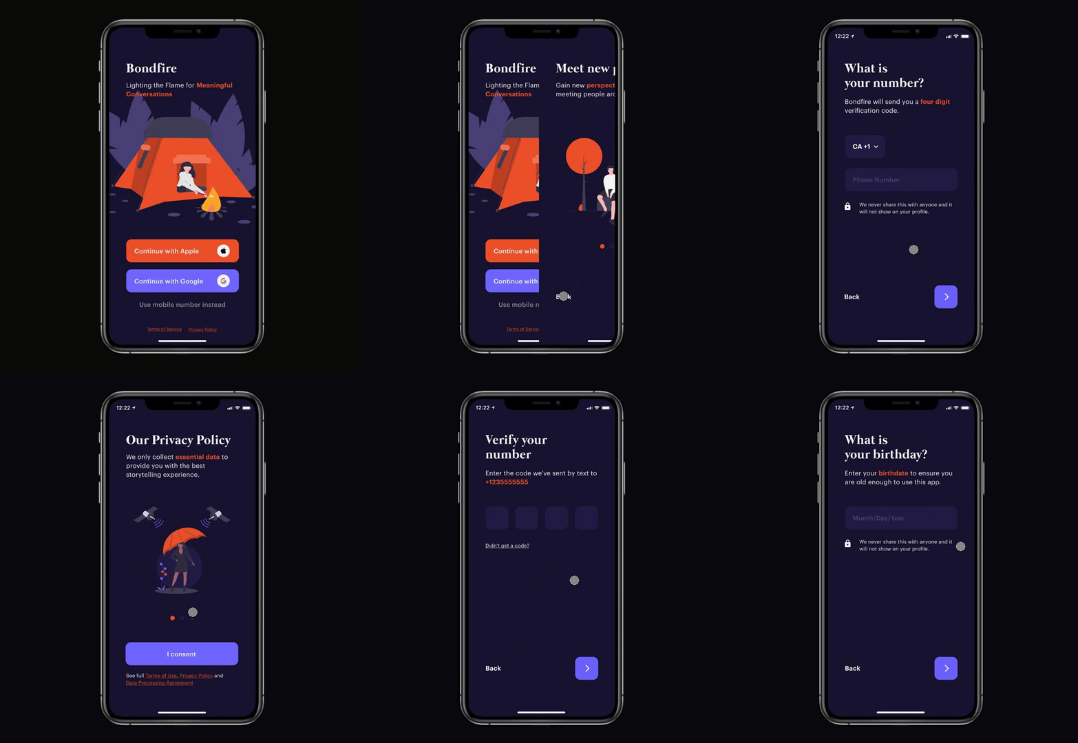
First-time users go through a simple five-step onboarding to not only help us set up their profile but also to help funnel through a network of verified and trustworthy users through multi-level authentication (Sign up with Google, Apple or mobile number).
Exploring Campsites
Organized by category, users are able to join a plethora of rooms (campsites) to socialize with friends or strangers. Each campsite allows users to interact with each other, by either telling stories about past experiences or simply answering the random prompts the app provides.
Live campsites allow for a private experience with a group of friends or strangers. Users are able to build a meaningful connection in a more impactful way through storytelling.
Transparency Throughout the App
With the help of visual privacy policies, multi-level authentication, privacy reminders, and the use of machine learning, our product provides users with a safe environment to express themselves. Users are constantly informed about the collection of data and reminded about the privacy implications of their actions.
Privacy was a huge aspect of our app, in fact one of our unique selling points. We believe the transparency we provide will build trust and help our users feel safe when using our product.
THE PROCESS
RESEARCH INSIGHTS
50+ university students were surveyed and interviewed to help us further understand the difficulties throughout the pandemic.
KEY INSIGHT #1
Social distancing impacted the ability for many to connect with others emotionally and physically.
KEY INSIGHT #2
82% of survey respondents have been using social media to connect with others during the pandemic.
KEY INSIGHT #3
70% of survey respondents found it difficult to connect on a deeper level with the current social media market.
RESULT
Switching focus to relationship building
Insights from our user research led us to focus more on the idea of relationship building, and how human connections can be made and developed. During our research, we came across the idea of storytelling and how one’s past experiences help people resonate with others ultimately forming a deeper bond.
The new site saw a 200% increase in website traffic and 125% in conversion rates. The new website also reduced bounce rate by 72% and increased average session duration by 65%.
IDEATION
Most authentic way to build relationships
We conducted a thorough competitive analysis to help identify common trends in the social media industry, we explored a wide range of ideas on how users can effectively connect with others on a deeper level. Due to the time restrictions of the hackathon, the best course of action to validate our idea was to ask other students their personal opinions on the ideas generated.
FEED OF VIDEO, TEXT, AND IMAGES
“Not a fan, it’s been done already, it will look like every single social media app out there”
FEED OF SHORT AUDIO CLIPS
“Interesting idea but not sure if I would use an app purely for listening to audio clips, kind of boring”
NO FEED, REAL-TIME AUDIO ROOMS
“Sounds like a fun way to meet people, however, would also want to face-to-face interaction”
Due to the time restrictions of the hackathon, the best course of action to validate our idea was to ask other students their personal opinions on the ideas generated. We decided to go with live audio rooms as they mimic real-life campfire talk and is a viable business idea.
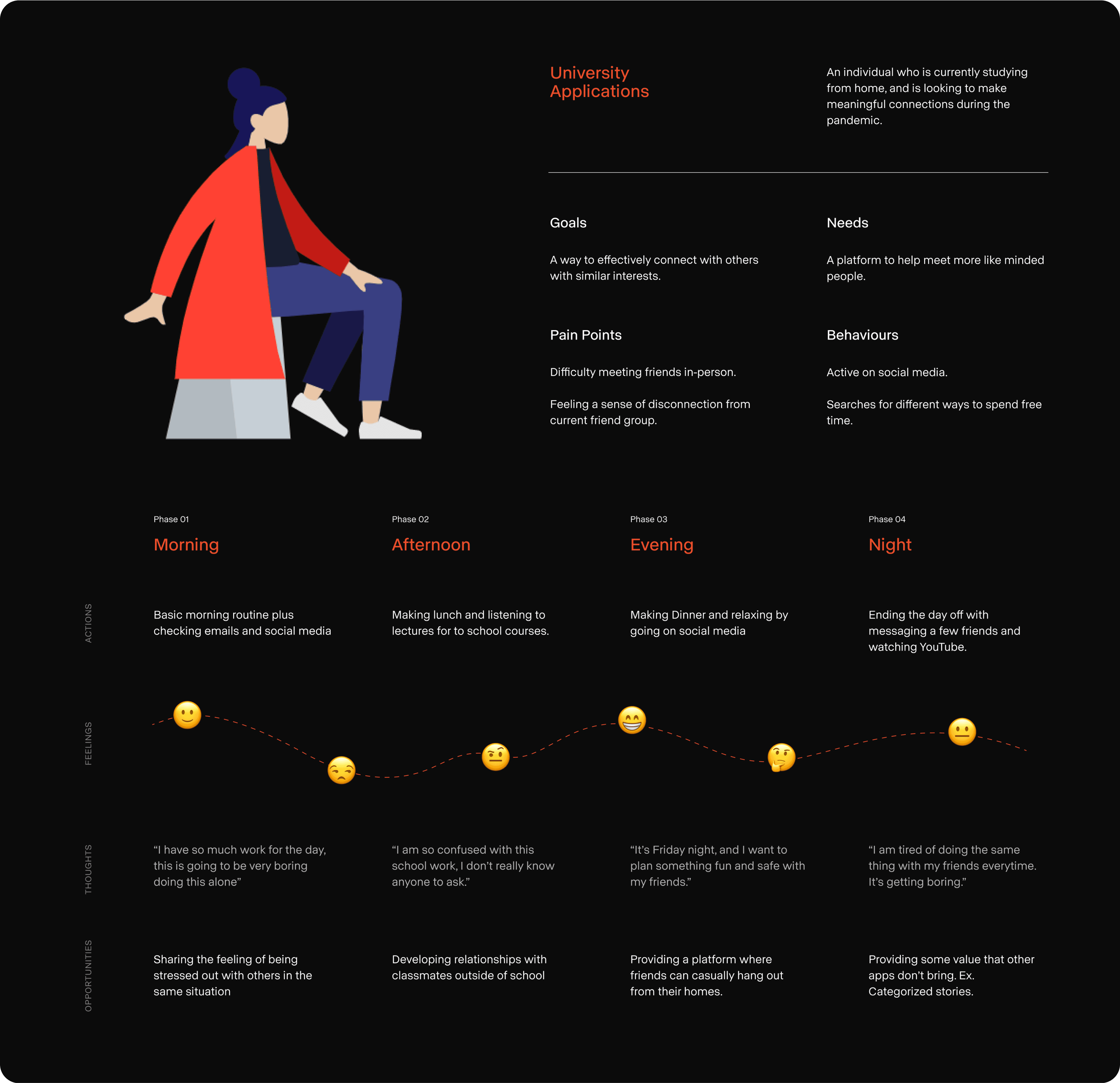
USER JOURNEY AND PERSONA
Identifying our user’s needs and pain points throughout the day helped us determine the key features for our product.
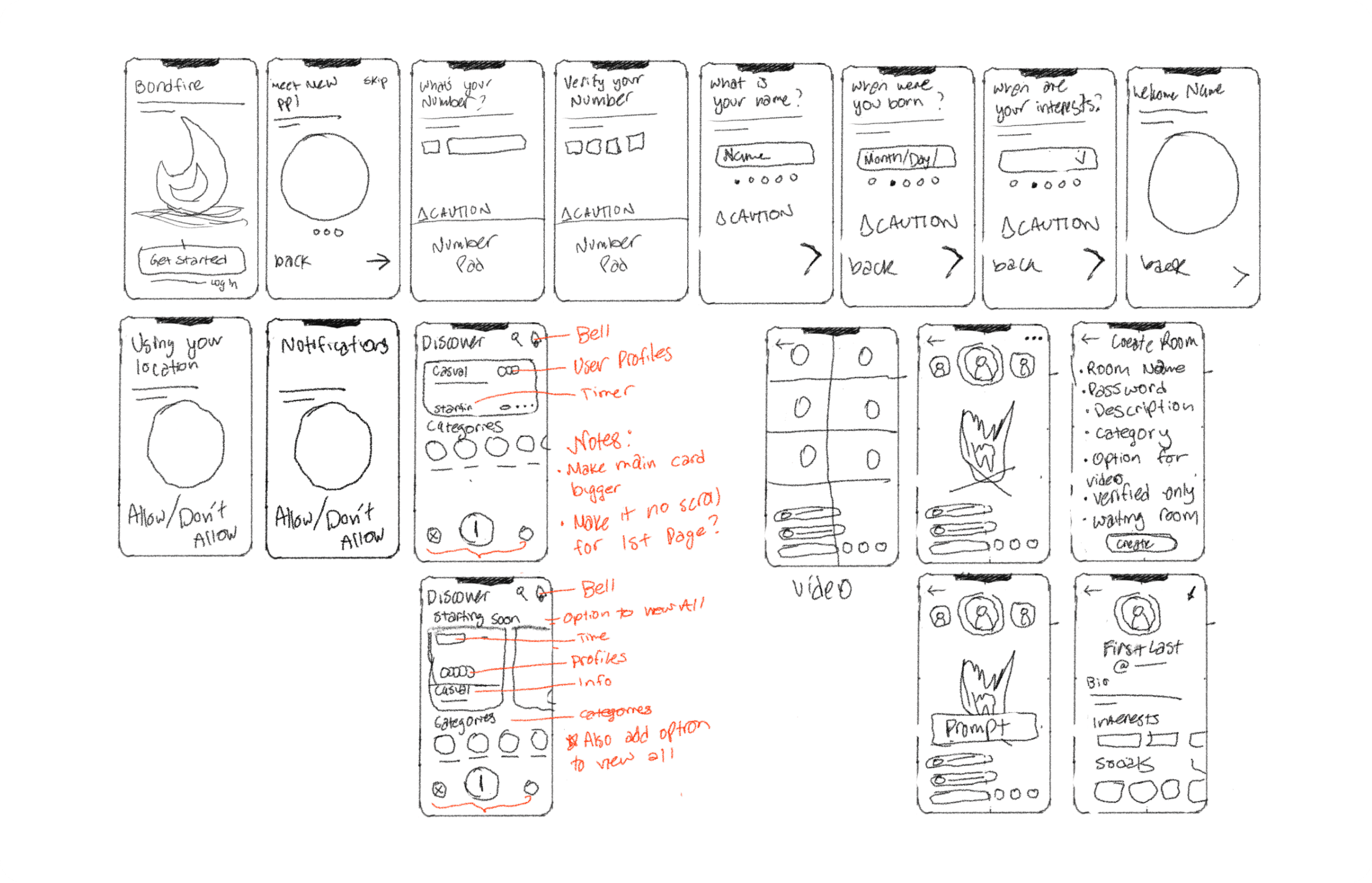
WIREFRAMES
Sketching out the initial low-fidelity wireframes helped us determine the look of our product and its potential user flow.
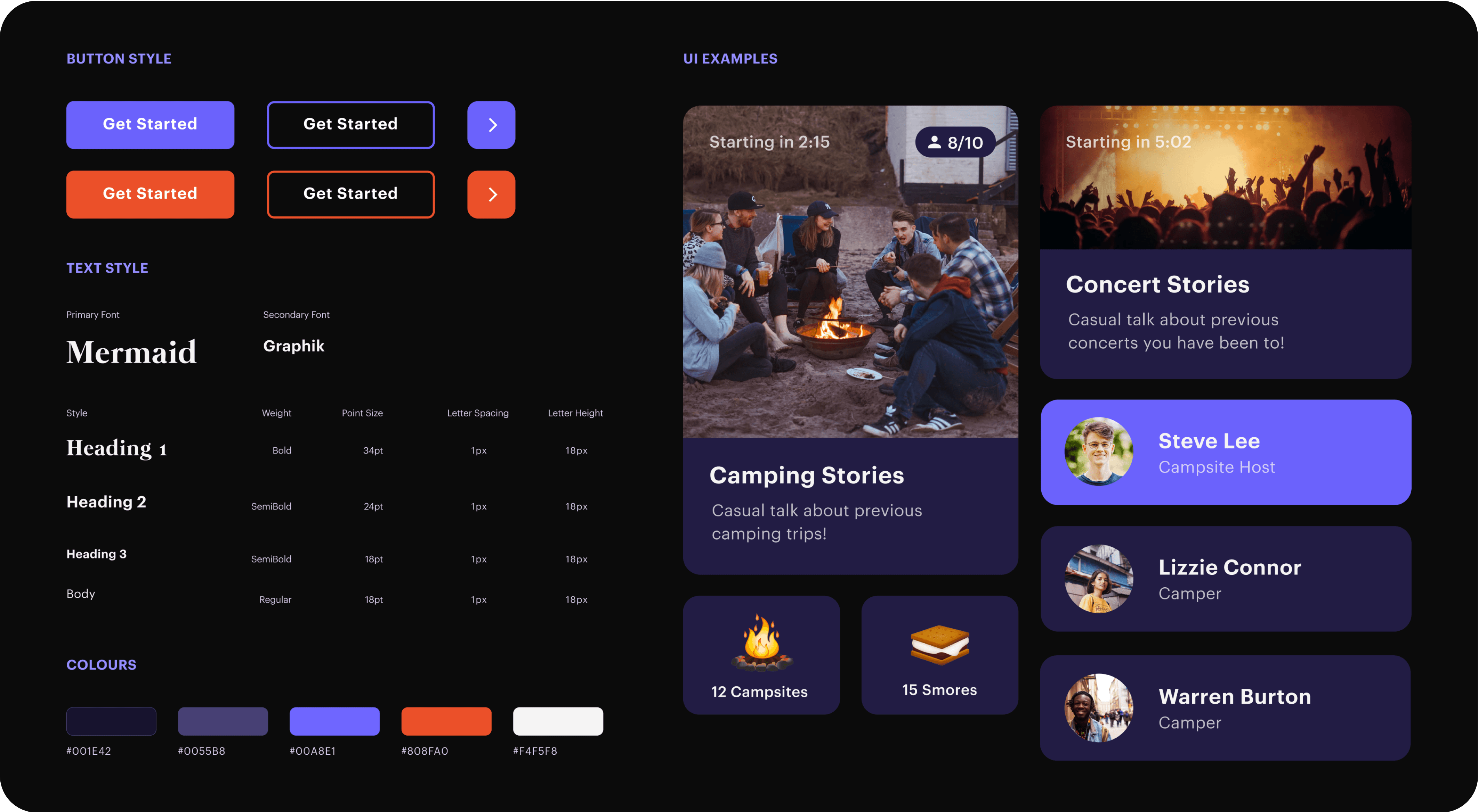
VISUAL DESIGN
Emulating an inviting and real-life night sky experience
Bondfire’s style guide features purple tones with a vibrant orange to create a more inviting experience for the user. The use of cards and imagery in the UI is visually appealing, groups information, and helps the user digest the information effectively.
KEY TAKEAWAYS
🧩 Redefining the Problem Space
The problem space was really broad for this hackathon and talking to other students and professors really helped us narrow down on a specific problem with social distancing. I learned that narrowing down on the specifics helps find a more viable and better solution in the end.
🔒 Designing for Privacy
This was probably one of my biggest takeaways so far in my career. It made me reflect on what sort of products we use every day, how we use them, and how secure they really are. This hackathon inspired me to start learning more about privacy-conscious design and how I can start fighting for the users.
Thanks for Reading! Check out some of my other projects
For more work inquiries, or just want to hangout? Send me over a message, and let's chat


